To design and develop an interactive globe
As humans, we’re driven to build models of our world.
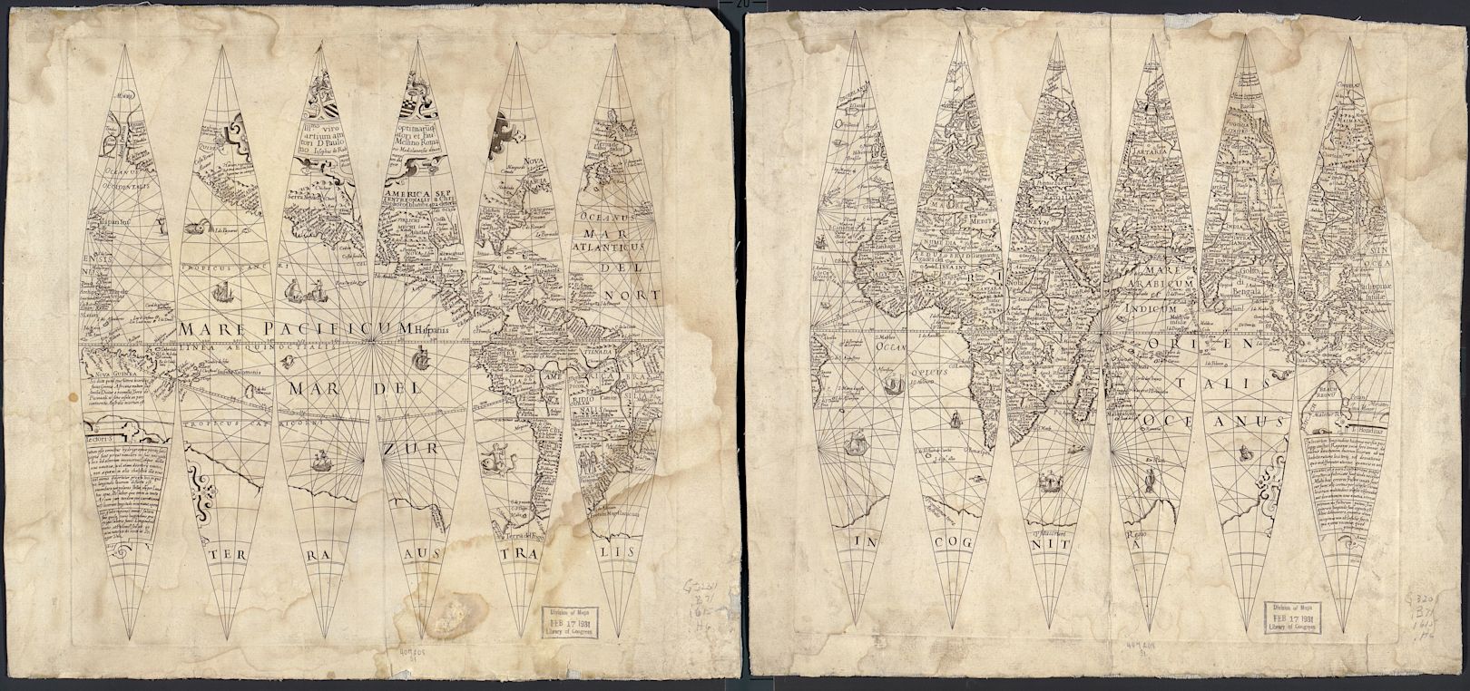
A traditional globemaker molds a sphere, mounts it on an axle, balances it with hidden weights, and precisely applies gores—triangular strips of printed earth—to avoid overlap and align latitudes. Cartographers face unenviable trade-offs when making maps. They can either retain the shape of countries, but warp their size—or maintain the size of countries, but contort their shape. In preserving one aspect of our world, they distort another.

These are terrestrial globe gores reissued by Giuseppe di Rossi in 1615.
As visual designers and software engineers, we’re modeling a piece of the world every time we build software. In some cases, it’s the entire world—and that digital world is animated and interactive. There are tools that render 3D objects on the web, but they’re considered sorcery by many. And conjuring that magic doesn’t come without sweat. In WebGL, displaying a single triangle—like a globemaker’s gore—with no lights, textures, interactivity, or motion requires 50+ lines of code.
For the new stripe.com, we built a 1:40 million-scale, interactive 3D model of the earth. We wanted to convey the interconnected nature of the internet economy and the global scale of our service, while acknowledging how much ground is yet to be covered. Despite expansion to 40 countries and payment processing from 195 countries, we grapple with the complexity of cross-border operations and expansion every day.
We set out to build a globe that inspires a sense of awe, invites people to explore, and conceals details for discovery. Along the way, we evaluated existing tools, designed our own solution, solved four interesting technical challenges, and improved the way we collaborate. Here’s what we learned.
Ways to build the world
It wasn’t a given that we’d build an interactive 3D globe on our landing page. We designed our first version of the globe to communicate nuanced data about the amount of online, cross-border commerce happening between each country. For this reason, it includes extra visual details like country borders. For our landing page, the goal of the globe was to capture our global scale and bring a visual metaphor to life. A week before launch, we had a nice animated map where the globe now sits but we didn’t love it. Despite the impending release, an executive (it was Patrick) posed to us: what would you build if you had the time to do it the way you wish you could?
We decided on a globe—and felt it was a better option for three reasons. First, using a sphere to display the earth takes up less than 20% of the screen area required to display the world in two dimensions. Second, a globe more accurately portrays the relative size, shape, and orientation of countries and bodies of water, even though visibility of the entire world at a glance is easier with a map. (More than ¾ of the globe is either hidden on the reverse hemisphere or obscured by its curvature.) Lastly, as an interactive experience, spinning a globe is much more satisfying than scanning a map.

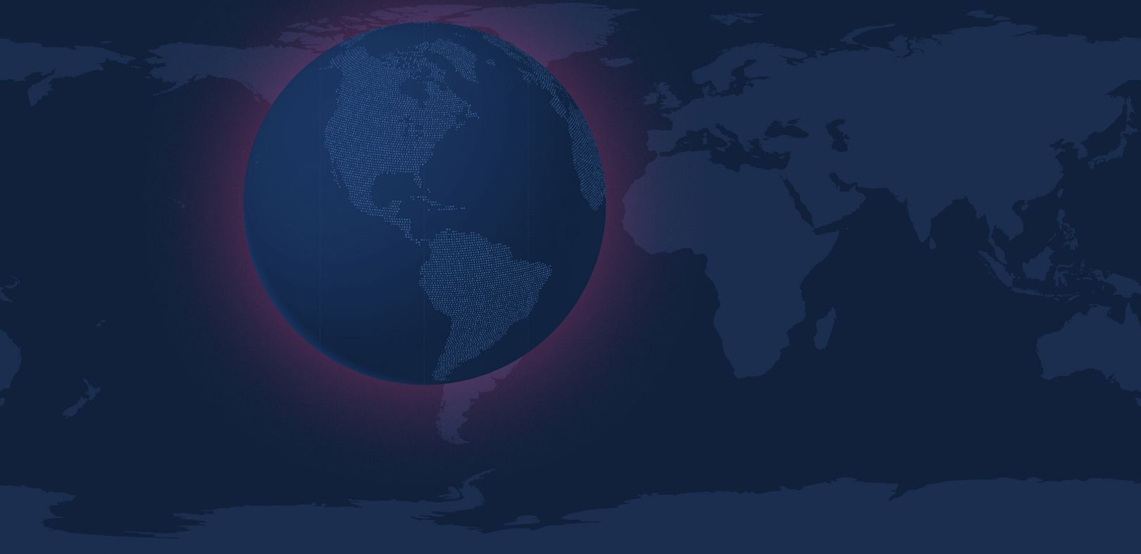
The sphere occupies approximately 17% of the total area of the map.
Once we settled on a globe, we had to work out how to bring it to life.
If we had known precisely the globe we wanted to build, we’d have been foolish not to hire GlobeKit. Instead, not knowing what we did not know, we decided to figure it out ourselves. The primary tools used to render 3D objects on the web, WebGL and GLSL shaders, can be daunting. Developers writing shaders can get by without deep knowledge of trigonometry and linear algebra, but a good understanding of these disciplines make 3D graphics development substantially easier.
None of us on the team considered ourselves 3D artists, so we leaned on each other, the internet, and friends to help solve technical problems. To start, the project’s design lead created the best approximation of her vision of the globe in Photoshop. We naturally kept the globe’s design fluid, making it easy to adopt better ideas as they emerged without feeling precious about what was discarded.
When it became clear that writing our own 3D engine was out of scope, we decided to use Three.js. Three is an approachable layer for WebGL, which abstracts away much of its complexity behind a well-documented API. Originally ported from ActionScript (Flash) in 2010, Three helped us create rich 3D graphics that render in real-time in the browser without needing to define how light reflects on every pixel of every shape.

To render a Three.js scene, you need a renderer, a DOM element to render in, a scene, a camera, and a mesh with both material (fragment shader) and geometry (vertex shader).
Ten years after its release, Three.js matches—or surpasses—much of what was possible in Flash a decade ago. The most engaging interactive experiences on the web are now built with Three. The community’s enthusiasm bears resemblance to the early days of ActionScript with the added benefit of running on mobile browsers and requiring no plugins. As Three.js and WebGL gain popularity, approachability, and support, the web is poised to embrace 3D en masse. Since WebGL is GPU-accelerated, it’s capable of processing a surprising amount of continuous visual change without bottlenecking on the CPU even on lower-end consumer hardware. Finding the boundary between making our globe feel alive and crashing the browser would emerge as our greatest technical hurdle. But it wouldn’t be the only one.
Global issues
Like the challenges we faced, our globe goes a few levels deep. It’s composed of three distinct layers, despite appearing as a single surface. The base layer represents the oceans, and is a semi-transparent sphere with ~50 segments both horizontally and vertically. The second layer is another sphere textured with tens of thousands of twinkling dots. The outermost layer is made of animated arcs of color which travel from one pulsing disc to another, wrapping themselves around the two spheres. The arcs travel from any country where Stripe accepts payments to countries where businesses accept payments using Stripe.
We encountered several significant technical challenges along the way, each of which could have prevented us from realizing our vision. For the benefit of those generating their own interactive globes—or similar complex 3D objects—let’s break a few of these challenges down.
We stacked each layer of the globe to produce a single visual surface.
Challenge 1: Fill the surface with dots
The primary purpose of the outermost sphere—a layer of tens of thousands of dots—is to define continents. But as we removed the visual complexity of borders and animated each dot, they did more than communicate land masses; they made the globe feel alive. To make them work, we had two main requirements. The first step was to find a way to maintain consistent spacing between every row and column of dots, from pole to pole. Second, we needed to animate each dot individually.
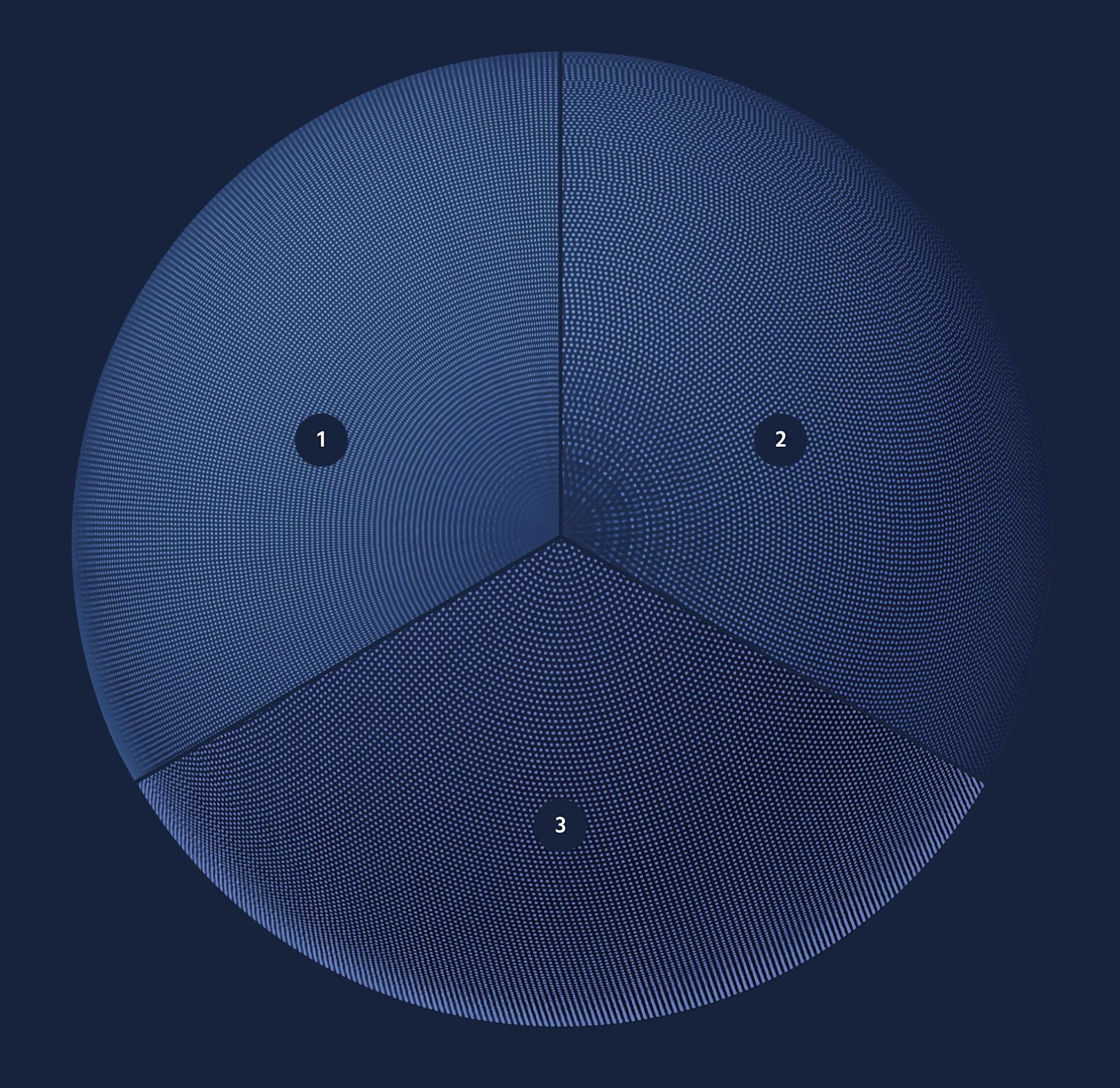
Before landing on our final design, we tested and considered three different approaches to filling open space with a cluster of dots (as shown in the image below). Each attempt had its benefits and drawbacks.

This is the North Pole of the globe, mapped with dots using three different approaches.
- Image of evenly spaced dots. This approach is the simplest to create, but quickly becomes problematic. The dots fuse together as the circumference of each row shrinks as it nears the poles of the globe. As a static bitmap rather than geometry, we couldn’t animate each dot individually without an overly complex shader.
- Image of unevenly spaced dots. We increased the width and horizontal spacing in the rows of dots. The image of nearly 80,000 dots places fewer, wider dots at the top and bottom. This tweak helps prevent the pinching and clumping of dots at the globe’s poles which invalidated the previous approach. When mapped as a texture onto a sphere, this image creates a nearly uniform spacing of dots. At first, we created this image texture by hand, then generated an SVG with JavaScript. This option better met our visual goals but still didn’t let us animate each dot. We assumed Three.js would work well with SVGs, but since every shape must be converted to a triangle, the complexity of the conversion deterred us from this approach.
- Programmatically-generated layer (vs. an image) The most straightforward way to animate individual dots is to generate them in a three-dimensional space. To do this, we reused the code from our SVG to generate rows of dots as geometry in Three.js. Each row includes a different number of dots, from zero at the poles to five hundred at the equator. We used a sine function to choose the number of dots for each row, plotted each dot, and applied the
lookAtmethod to rotate each dot to face the center of the sphere. However, the number of dots jumped inconsistently along a few latitudes, creating harsh lines and an unnatural effect in the longitudinal columns.
The final attempt—and right design—utilized a sunflower pattern. Like a sunflower’s pattern of seeds, the dots are a sequence of hexagons tightly coiled around latitudes from the top to the bottom of a sphere. Using the built in setFromSphericalCoords method we settled on this solution:
The spiral sunflower pattern was the winning design.
Challenge 2: Group the dots by country
On the globe at stripe.com, dots form continents and light up where Stripe is live. In a previous iteration, we grouped dots by country to indicate where Stripe operates. We decided to turn this feature off for the interactive globe on our landing page, but thought it might be worthwhile to share how we approached grouping dots by country.
Once we filled the globe with dots, the next step was to transform our layers of spheres into a globe by defining countries. Our first goal was to make dots appear only within the borders of countries where Stripe is live. Once that was done, we needed dots within those live countries to be targets for animation as a group.

Each country where Stripe is live is given a unique color for identification.
A teammate who had recently experimented with shaders for a gaming project brought inspiration to this challenge. He thought to encode a PNG image with a unique color for each country where Stripe is live (see above). We used the built-in canvas getImageData to give us the color of each pixel in the image. Then, we matched each color to an array of country colors, tagging every dot with a unique countryId before passing its coordinates to the shader for rendering. Now we could isolate the group of dots in any country and animate its color, opacity, and position in z-space.
In 2020, each country where Stripe is live is indicated by a unique color. The assumed drawback to generating all of the dots as individual geometry was the astronomical number of calculations required to animate the properties of 60,000 dots 60 times per second. Lucky for us, the earth’s surface is mostly water. By only rendering geometry for countries where Stripe is live, we were able to reduce the geometry from 60,000 dots to ~20,000 dots passing a fraction of the data to the vertex shader. By pushing less data to the shader, we freed up rendering budget for use by other animations.
Challenge 3: Animate it all
After filling in the surface with dots and grouping them into countries, we needed to connect the dots to show how and where business is done globally. Our goal was to bring the globe to life, which meant adding animation. Early on, we knew we’d need to get the globe spinning, each dot twinkling, and bend arcs between countries to indicate transaction patterns. We wanted visitors to be able to control and spin the globe.
Around the time we started animating, we got a new teammate. In a past life, he had engineered the scrolling of the iconic Pencil by 53 site. In short order, he added animations for undulating, aurora borealis-like lights, made the globe rotate on page load, and spun the earth when the user scrolled the page. We handled the subtly twinkling dots and arcs with a custom fragment shader (and a lot of help from thebookofshaders.com) but the rest of the animation is vanilla JavaScript. requestAnimationFrame drives the motion of the arcs, the spinning of the globe, and the changing of colors.
Challenge 4: Make it performant
Early on, we discussed our expectations for the globe’s performance on different browsers to frame our requirements. We boiled those expectations down to one requirement: all animation and scrolling effects had to perform at 60fps (to match the common device refresh rate of 60hz). If this condition couldn’t be met, we were prepared to fall back to a static image. Thanks to GPU-acceleration of WebGL and some of the findings mentioned here, we never had to abandon our interactive globe.
Initially, we ruled out mobile support. We assumed that scrolling and 3D animation would be too much for any machine, and that we’d have to either accept some lag or reduced motion on both smaller and more underpowered machines, or settle for the fallback. But as we learned about the capabilities of GPUs, we kept raising our expectations. Most of what’s possible in WebGL works on mobile without modification. We did make minor adjustments: during scroll, we pause all animations and debounce using Lodash so the globe spins without visual hiccups.
A few days prior to launch, we tested the page on laptops without dedicated GPUs and reported that they were struggling to power a 5K display with the globe running fullscreen. We weren’t willing to accept defeat by falling back to an image for this rare case. Instead, we cycled through all possible bottlenecks one by one. No matter how much we simplified the geometry, stopped animations, or killed lights and shaders, we couldn’t smooth it out.
On a whim, we turned off the antialias parameter of the WebGL renderer. This one change not only fixed the issue on high-res monitors, but also improved performance of the animation and smoothness of scrolling on all devices, even those already running at 60fps. One might assume that removing antialiasing would make everything look pixelated. Since it only applies to the edges of the geometry, our image textures were still smooth and gradients and lighting were unaffected. Though pixelation occurs minimally on the arcs around the globe, the performance gain was significant enough to accept a tradeoff.
Designing a better world
Tectonic plates arrange continents, but countries—how we organize the globe—are defined by people. It’s the same with organizations: how we define teams determines how we operate. We’ve found that establishing how designers and engineers relate, collaborate, and organize has an outsized influence in how we build. There’s a long line of designers and developers with a mutual respect for both pixels and code. This rapport sidesteps many pitfalls when building products: the transfer of pressure from designer to developer to deliver stunning visuals, to engineers diluting the vision at the eleventh hour. Blending design and engineering complicates the process, but enriches the result.
We could only properly evaluate our globe once we built a functional prototype with a sphere on the screen to examine. Modern software development is often built modularly, snapping components together until it’s ready to ship. We pledged to build the real, whole product, even in its earliest—and ugliest—stages. This enabled us to separate its functionality from its finality, focusing less on if it worked and more on when it worked well enough for us to ship it. This released us from the temptation to make sacrifices in quality just to make the globe fully operative.
Building a fully-functional prototype early in our development process focussed our highly cross-functional team; over time and through iteration, improvements unfolded gradually. Since its first incarnation in 2019, we’ve used the globe for mockups, keynotes, websites, and a small, but momentous appearance in Stripe’s Dashboard.
Measures of time are actually measures of the earth’s rotation: sixty units of rotation per minute, and sixty minutes of rotation per hour. As our product expands to cover the surface of the globe, we’ll keep smoothing the rough edges, connecting dots in distant countries, and working to keep the world spinning at 60 frames per second.
