In the beginning, there’s the landing page.
It’s often the first impression of a company: a digital introduction to an organization, the problem it tackles, and the solutions it offers. The sophistication of landing pages can vary. Some companies use their homepage as a landing page. Others create specific pages that target discrete customer profiles and move them through a marketing funnel.
Landing pages also take various forms depending on the growth stage of a company. But that’s one of the common missteps that I see: Landing pages prioritize the story of the startup rather than the journey of the customer with the startup.
Landing page copy improves the more customers see themselves in it. Rethink and revise your landing page by building it around three elements. If that’s too much effort and you’re looking for fast fixes, the following tips will improve your current landing page copy.
Quick wins for better landing page copy
Focus copy on them. Landing pages often say “we offer” or “our solution,” which focuses on the wrong thing—your company, not your customers. Go through each sentence in your copy and rewrite it to address your customers. One way to do this is to begin with the word “you.” Another tip is to start your sentence with a verb. Focusing on them nearly guarantees that your copy will address—and speak to—your visitor. Modern Fertility provides a good example of what this looks like:
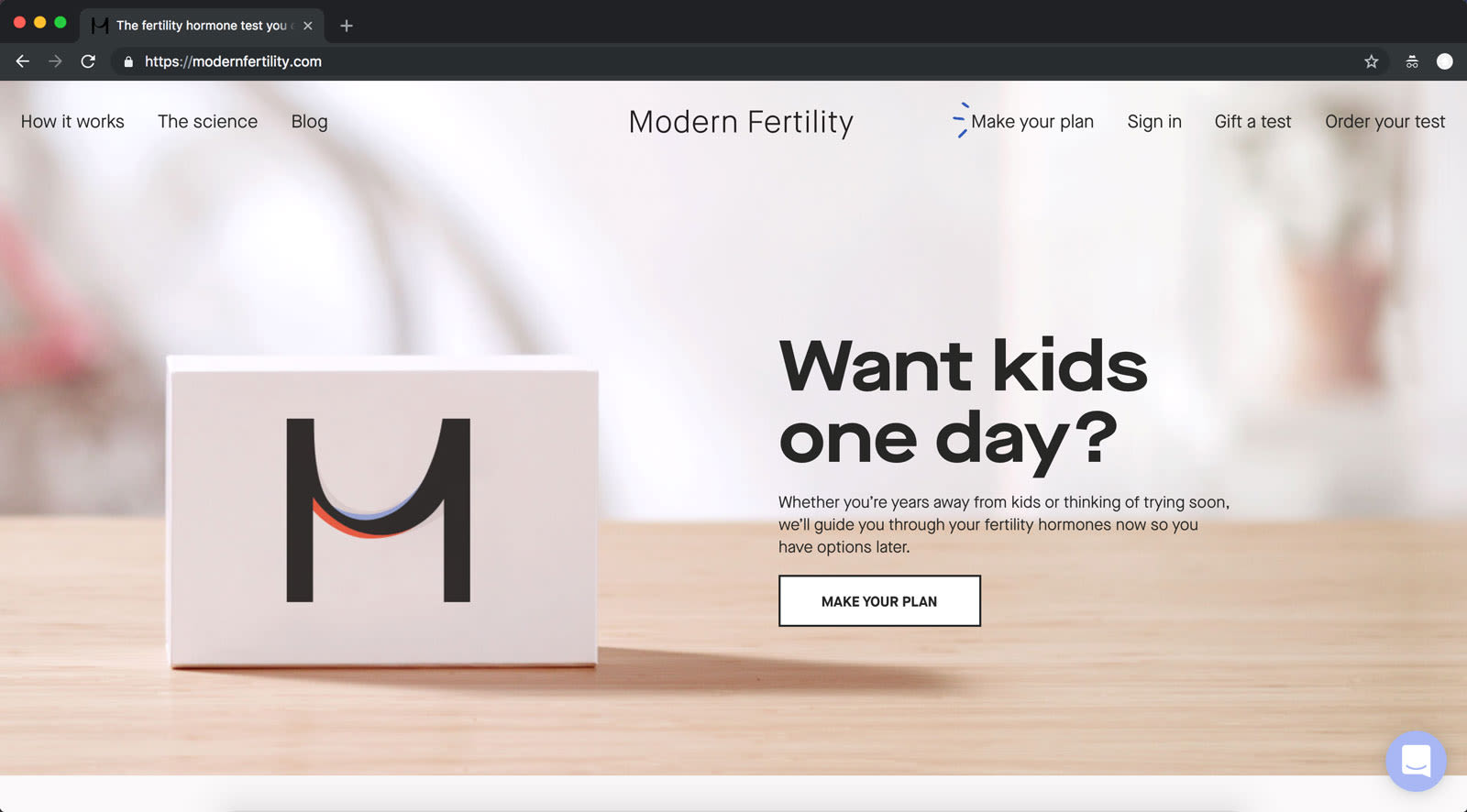
The only possible exception to leading with “you” in your copy is if you’re a service business, where prospects want to see what you do differently as a service provider. That’s often expressed as “we” language. But it doesn’t have to be. It just very often is.
Add pattern, texture, and shine to a block of copy. Accurate, succinct, and grammatically correct copy can still feel flat. Patterns, texture, and shine can add another dimension to your copy, making it more engaging and memorable. Here’s how:
Apply a pattern to a sentence. Patterns may be used to subtly reference a logo or map out a theme. Take a logistics company that transports goods by railway. Perhaps it not only wants to deliver a message but also simulate a train with a pattern of evenly spaced dots in a horizontal line. To mimic that visual, rewrite landing page copy to link only words of similar length, such as three- or four-letter words.
Vary sentence length and formatting to create texture. Texture can make copy feel more conversational, natural, and engaging. To create texture, write a smooth, polished sentence and juxtapose it with a more staccato sentence. Throw in some short sentences. More. More. And maybe one more. And then add a sentence that goes a lot longer, using clauses to lure your reader along. Then stop. The result? Texture.
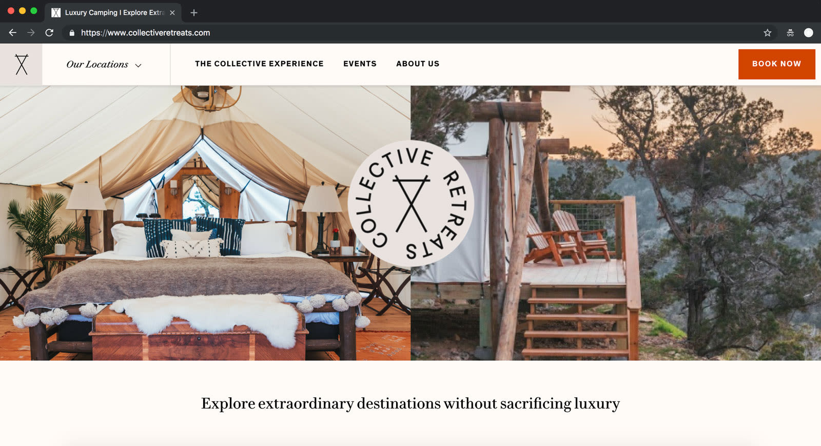
Include a glossy word or two for shine. Polish might mean swapping in a few new words. Find a bland word in your copy, and replace it with a more dazzling synonym. Take the Collective Retreats landing page copy below. Instead of “Find destinations without losing luxury,” try “Explore extraordinary destinations without sacrificing luxury.” The bright adjective and stronger verbs add punch to the copy.
Defang objections with an “even if” clause. If you can anticipate what might keep someone from believing your claim or assertion, undercut that opposition by acknowledging it. It’ll hint that you understand their fear, uncertainty, and doubt—and suggest that your solution takes those considerations into account. The formula is simple: “[Claim] even if [objection].” A very simple example is: “Be creative even if you’re not creative.” Here’s an “even if” clause in the wild:

Limit each sentence to one idea. Sentences have the capacity to carry a lot of information, but your reader cannot. Your readers depend on periods, question marks, and even exclamation marks to give their brains a short rest—just enough of a reprieve to absorb information before moving on. The more you help readers with information digestion, the more appetite they’ll have to read on. So edit every sentence to have just one thought. Not two. Not three. Apple is skilled at this technique, but even it has opportunities:
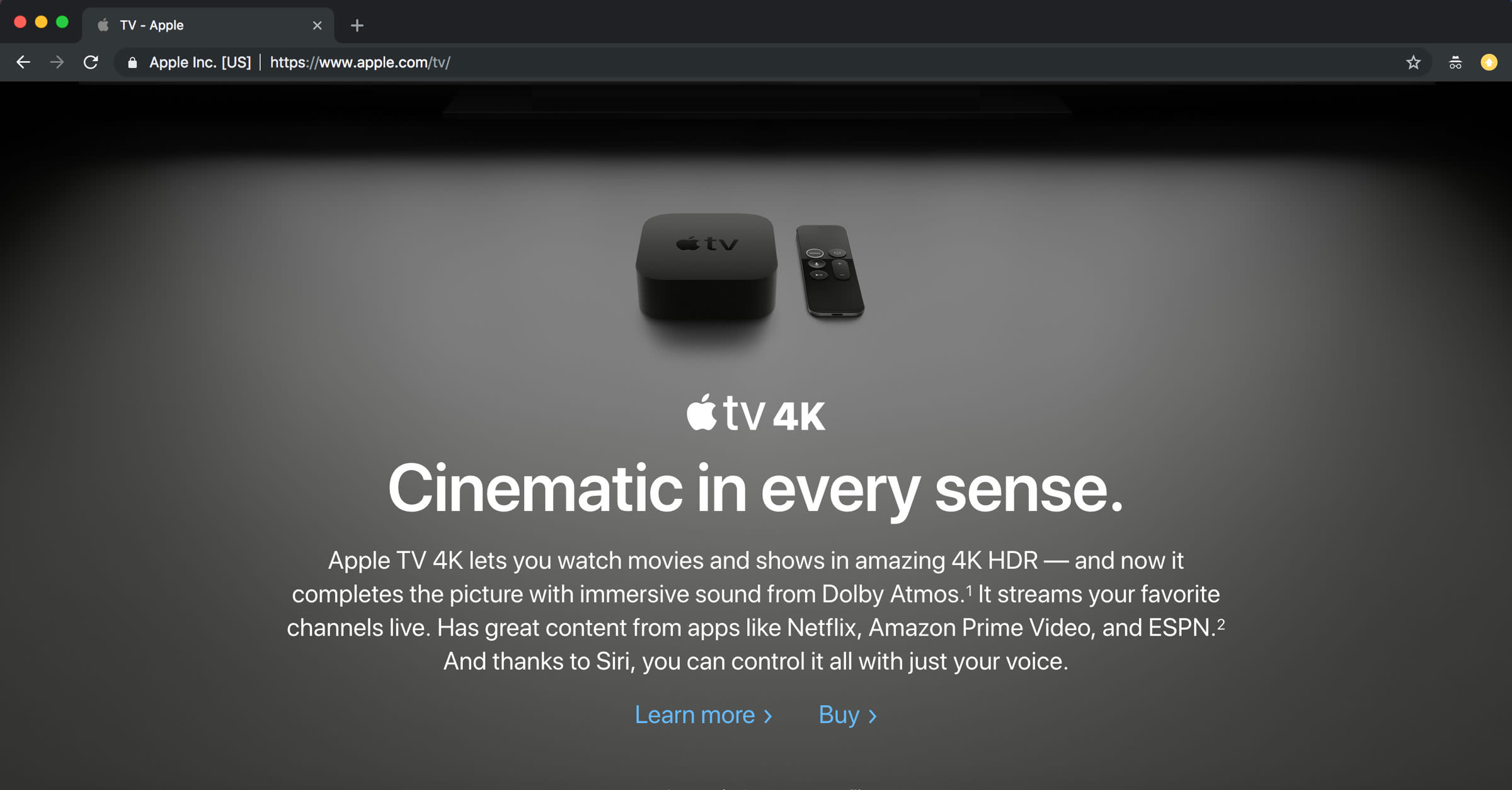
Take its copy for Apple TV 4K. Most of the sentences don’t qualify as sentences, but they absolutely follow the rule. Here’s the one that doesn’t: “Apple TV 4K lets you watch movies and shows in amazing 4K HDR—and now it completes the picture with immersive sound from Dolby Atmos.” This sentence merges two distinct features. The average reader would be better able to take in the information if that sentence were broken in two:
Apple TV 4K lets you watch movies and shows in amazing 4K HDR. It’s got immersive sound from Dolby Atmos. Streams your favorite channels live. Has great content from apps like Netflix, Amazon Prime Video, and ESPN. And thanks to Siri, you can control it all with just your voice.
Create a landing page that’s not your homepage. If you’ve recently created a website for your company, your landing page might be your homepage, but they’re two different creatures. A landing page is designed to convert prospects into customers. It speaks to visitors looking for something specific, features content relevant to that particular item, and contains a call to action (CTA) customized to that precise offering. On the other hand, a homepage serves a broad audience, features widely relevant content, and may not have an immediate CTA.
More sophisticated companies will route visitors who, say, search for products for large companies to a page geared toward enterprises rather than a homepage with general information. If you have a website with more than one page—or a more advanced information architecture and sitemap—consider linking to the page on your site that best addresses a visitor’s intent.
The foundational elements of effective landing page copy
First, the spoiler: Landing page copy is never done. Like your company, it will—and should—evolve over time. It’s an iterative process, and can always be improved. There are hundreds of copywriting formulas (many of them documented here) that can help you craft a headline, draft bullets, or structure a CTA. But if you don’t have the fundamentals down, the improvement will be incremental, not game changing.
Copy for a high-performing landing page has three foundational qualities:
It delivers a convincing first impression of the startup. At a fundamental level, this involves direct, specific, and grammatically correct copy. That level of precision and professionalism sets expectations and raises the bar for future engagements with a company’s product and team.
It considers the maturity of the market. Every market—like every company—is in its own stage of development. Companies in highly mature markets can use short copy, because most visitors already get the ins and outs of the solution or category (e.g., disposable razors). Their focus should be on product differentiators, the brand story, and who’s using it. If a market is still emerging (e.g., cryptocurrency in 2018) customers likely need more information, because a company is not only educating about its solution but also helping define the category more broadly.
It reflects the customer’s stage of awareness. Effective landing page copy mirrors customer comprehension, which is layered and includes: how well a customer understands the challenge the company addresses (e.g., data privacy), what’s at stake (e.g., personal data and/or compliance), the changing landscape (e.g., GDPR), and tools that help (e.g., a specific product).
In short, great copy demonstrates that a company grasps how aware customers are of the market, its pain points, and potential solutions. The best copy does all that and signals that the company is clued into precisely how aware the customers are of themselves. Here are the five stages of awareness for any visitor to your landing page:
Most aware. Visitors totally understand your solution and likely believe it’s a top contender for them. They just need nudging. Purchases happen here.
Product aware. Visitors are learning about your product. Free trials, demos, and purchases happen here.
Solution aware. Visitors are considering solutions to their pain or problem.
Problem aware. Visitors are feeling pain or dealing with a problem.
Unaware. Visitors haven’t experienced a need that would drive them to your solution.
Landing page copy reflects the customer if you can answer “yes” to the following questions:
Is the language accessible, and does it mirror a visitor’s stage of awareness?
Does the copy move them from where they are to where they want to be?
Are visitors prompted to take action once they become product aware or most aware?
The elements of landing page copy in action
Every landing page should deliver a convincing first impression, consider the maturity of the market, and reflect the customer’s stage of awareness. The best way to see how the absence or presence of these elements alter a landing page is to review real-life examples. So, with the three foundational elements in mind, I’ve evaluated the landing pages of nine companies—from member management software to a vegan candy brand to a court date notification service. Here goes:
First impression: Make an accurate, trust-building, and lasting introduction
Company: Kapwing
What it does: Modern editor for videos, GIFs, and images
Landing page challenge: Copy that’s short but vague
The fix to apply: Get specific—but first, scroll down.

The Analysis
The headline—“Creativity made easy”—raises this question: Are people who’d use this solution not creative? The phrase suggests that it’s hard for your audience to be creative. Is that true?
The page falls victim to the myth that copy must be kept short at all costs. Many startups write three- or four-word headlines that try to say everything. It reduces the elevator pitch to a hiccup. Along the way, we tell ourselves we’re being succinct, because we understand that being succinct is good when it comes to communication.
But are you being succinct or are you being vague? Worse, are you sacrificing a clear message for a short one? Your headline is prime real estate. Let it do some real work—it’s made for it.
Think back to your last 10 conversations with a customer or prospect. (If you haven’t had at least 10, do that first.) At what point in the conversation did they perk up? That’s the fodder for a good headline—at least one that’s worth testing. That’s what should top your landing page.
With headlines, don’t take rich, nuanced feedback from customers and whittle it down to the smallest possible version. Instead listen. Write down what you hear. And put it on the page. You’ll clean it up so it’s on brand and persuasive, but it shouldn’t be boiled down.
The concern in boiling it down is that you’ll get too vague. Kapwing’s tools run the gamut. They make memes, add subtitles to video, create montages, and more. If you’re the marketing team, the temptation is to look at everything Kapwing does, plot it in a Venn diagram, and promote the overlapping part: the quality that all features, uses cases, and outputs have in common. That’s likely how “Creativity made easy” emerged.
That’s how mediocre headlines surface—and it happens surprisingly often, even to the most copy-savvy startups. Many founders use more effective headlines in their verbal elevator pitches or elsewhere in copy. That’s the case for Kapwing; the better options for a headline are further down in the copy:
Tasks that take hours in iMovie take minutes in Kapwing.
No install. No passwords. No technical tutorials. It works on every OS, on your phone and your computer.
Or
Bring on the memes.
Creative jobs that take hours in iMovie take just minutes in Kapwing.
Either copy expresses the ease of being creative in Kapwing in a specific, compelling way—and they serve as entry points to its other suite of tools. These messages should lead the page as a headline. Hidden headline copy happens to many businesses. It’s not that companies can’t generate good headlines; they’ve likely just buried them.
Company: WebGazer
What it does: Free website monitoring
Landing page challenge: We-focused copy
The fix to apply: “The Rule of You”

The Analysis
This headline works, as long as visitors arrive on the page knowing what WebGazer is and does. The copy might suffice if this is a retargeting page.
But what if it’s not? Let’s start with the phrase: “We help you keep your business running.” The very first word (“We”) is a problem. We-focused copy is an issue—almost without fail. It communicates from the perspective of the company, not the customer. It’s the equivalent of a person introducing themselves and dominating the airspace with their story. Correct “we-focused” copy by rewriting every sentence to begin with the word “you” or a verb. Here’s how WebGazer can change three sentences on its landing page:
|
Copia incentrata su di noi
|
Copia incentrata su di te
|
|---|---|
| Monitoriamo i tuoi siti senza sosta. Guarda tu stesso cosa abbiamo fatto oggi. | Puoi stare tranquillo perché monitoreremo il tuo sito senza sosta. |
| WebGazer controlla se il tuo sito web funziona come dovrebbe e ti avvisa se qualcosa va storto. | Mantieni la tua attività online senza interruzioni. WebGazer la monitora giorno e notte e ti avvisa se qualcosa va storto. |
| Ti aiutiamo a far funzionare la tua azienda. | Come fai a sapere se il tuo sito è diventato improvvisamente inattivo? |
Company: InfluenceKit
What it does: Automated reporting for sponsored content
Landing page challenge: A timely call to action
The fix to apply: AIDA
The Analysis
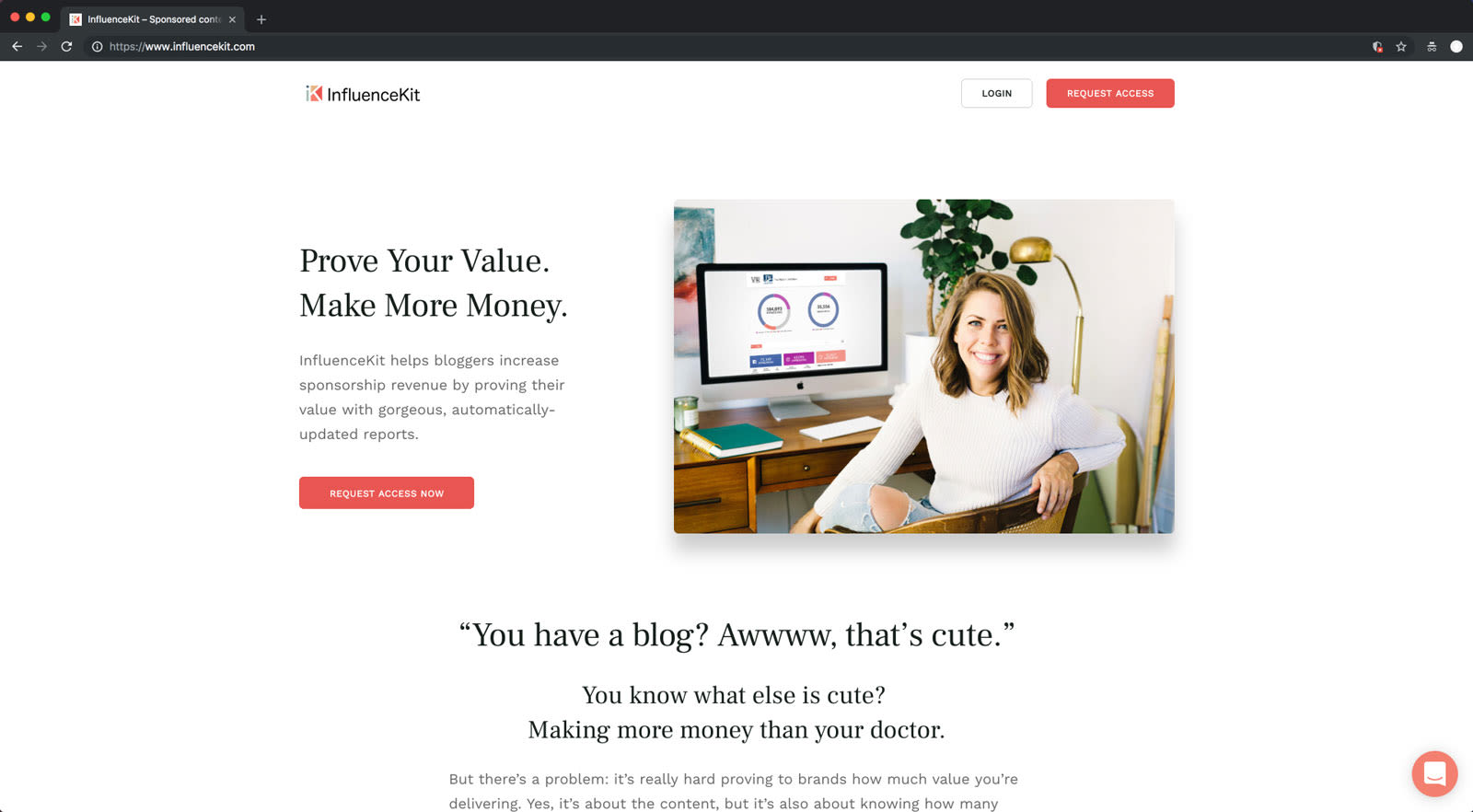
My first impression is how much is right with this landing page copy. It reads well and follows some of the strongest copywriting better practices, including:
- Removing distracting calls to action (e.g., no global navigation)
- Hooking visitors immediately with a highly desirable benefit (why they should care)
- Expanding on the benefit with product-specific support (how the product does it)
- Formatting copy for maximum readability (The three paragraphs of body copy under “You have a blog?” is a manageable column to read instead of spanning the width of the page, which is extremely fatiguing for the reading eye.)
- Using a voice that is present but not overwhelming (With few exceptions, they’ve used their voice in crossheads only, minimizing “interruptions” in how readers process information.)
- Leading with “you” wherever possible
- Making sentences short and easy to consume
The landing page copy has done so much right—the challenge is that it hasn’t cashed in on it. After making a convincing argument to the prospect, it forgets to end with a CTA. The AIDA framework can help outline this progression and missed opportunity.
AIDA: Attention, Interest, Desire, Action
Grab their attention. In this case, InfluenceKit starts to build trust and empathy by clearly articulating the problem many bloggers face: demonstrating value from content. The copy reads:
...it’s really hard proving to brands how much value you’re delivering.
Build up their interest in the subject. Here, the copy deepens that understanding by elaborating on the problem, causing readers to nod along and more fully recognize themselves in the challenge. This shared understanding builds further interest. The copy continues:
Yes, it’s about the content, but it’s also about knowing how many lives were impacted by what you created.
We all like to know where our money’s going (dang you, Target). Brands are just like us; they want to know what they’re getting for their investment. Reporting impressions is the industry standard for internet marketing, and up until now, bloggers have been a black hole of information.
Your blog is more than just pretty pictures; you have real influence. You know it, and we know it, and together we’re going to prove it.
Turn that casual interest into a direct desire for them to add the solution to their lives. The solution that’s offered is succinct and clear. The copy reads:
Show your real influence with powerful and dynamic reports.
Call them to action. There’s a CTA, but it’s in the wrong place. It’s buried beneath a list of integrations, the four-step process to set up InfluenceKit, an infographic on the two types of bloggers, and a Meet the Team section. Finally, there’s a call to action:
Ready to prove your value & make more money? Request access now (secret handshake to follow).
The copy has sufficiently made a case for action by the end of the four-part “How Does InfluenceKit Work?” section. Here, I’d expect—and encourage—a closing section, featuring:
A restatement of the value prop
A quick bullet list of results generated by the solution
A powerful screenshot
A CTA
A testimonial from a blogger or sponsor
A data point about average results
Perhaps InfluenceKit is a newer company, which is why there’s no data yet for how it’s paying off. But there’s power in being new. I’d suggest the founders share their own story and results thanks to InfluenceKit—being transparent all along that they’re the founders—to demonstrate that others can also benefit. Part of making a lasting first impression is creating a window for not only a prospect to relate but act and interact. That turns an impression into a relationship.
Market maturity: Reflect the state of your market in your copy
Company: Nomba
What it does: Digital-first vegan candy brand
Landing page challenge: The model to try or demo
The fix to apply: Map your market over your first customer engagement.
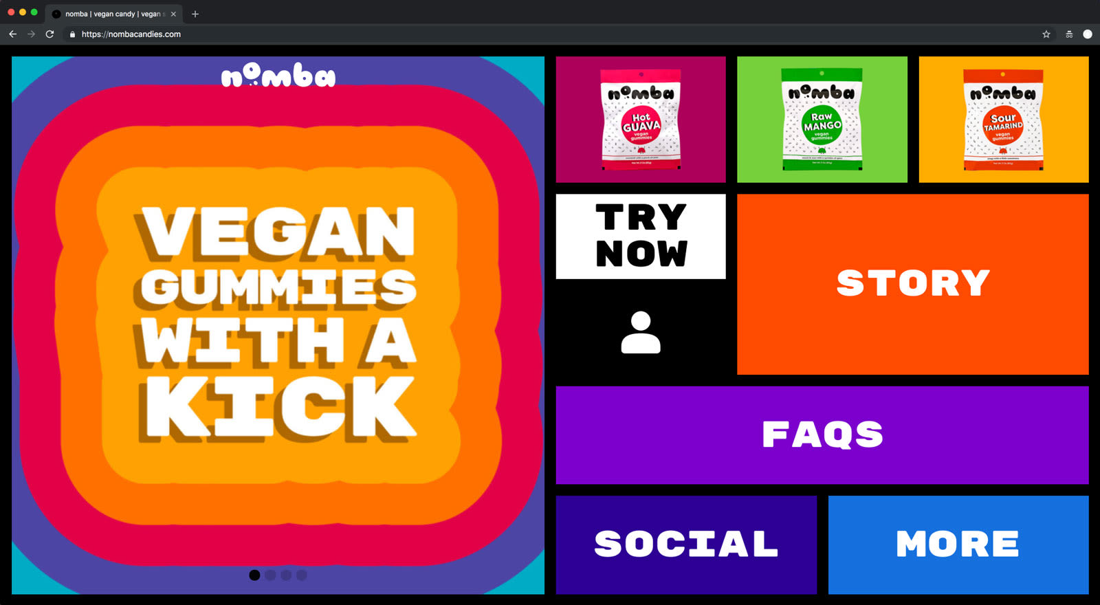
The Analysis
The “Try Now” language at the top of the landing page—and throughout the site—is confusing. But what’s more puzzling is the idea of a trial for this product.
For the mainstream consumer, trials are not typical in the world of buying candy. By offering a trial, you’ve effectively taken a super-sophisticated market of buyers—people who’ve bought candy, understand buying candy, and just wanna get vegan candy—and introduced doubt. Suddenly visitors are asking small questions that escalate into bigger concerns:
What does a trial mean in the world of candy?
Try food that’s shipped to me? Do I ship it back?
Will I get a sample or a full-sized product?
Wait. Is this a subscription I’ll have to work to get out of?
Do I even want spicy candy?
And just like that, they’re gone.
Your visitors go from wanting to give this spicy vegan candy a shot to hitting the back button and feeling relief that they got out of there as quickly as they did.
Nomba’s copy has a new challenge: It needs to deal with the “problem” of prospective customers not understanding the trial model for a food item. Here’s how it can do that:
First, know that you have to address the problem. But you do not have to go into great detail to address it. After all, this is a $5 treat or $15 investment in sugar.
Second, ask: What’s the easiest, quickest way to address the problem? Often, it’s in naming. Sometimes product features are better explained by renaming them, and pricing tiers are better explained by relabeling each tier. In this case, the trial may be better grokked by renaming it to sample pack or sampler.
Now the “Try Now” CTA could become any of the following:
Get the Sampler
Sample Nomba
Sample It
Nomba should keep that new language consistent throughout each product page and checkout to avoid further confusion. Any startup that offers demos or trials to win customers should craft their copy with not only their customer but their existing market in mind. The market part of product/market fit also matters.
Company: eve
What it does: Event management software
Landing page challenge: Overemphasis on the solution, not the problem
The fix to apply: PAS framework
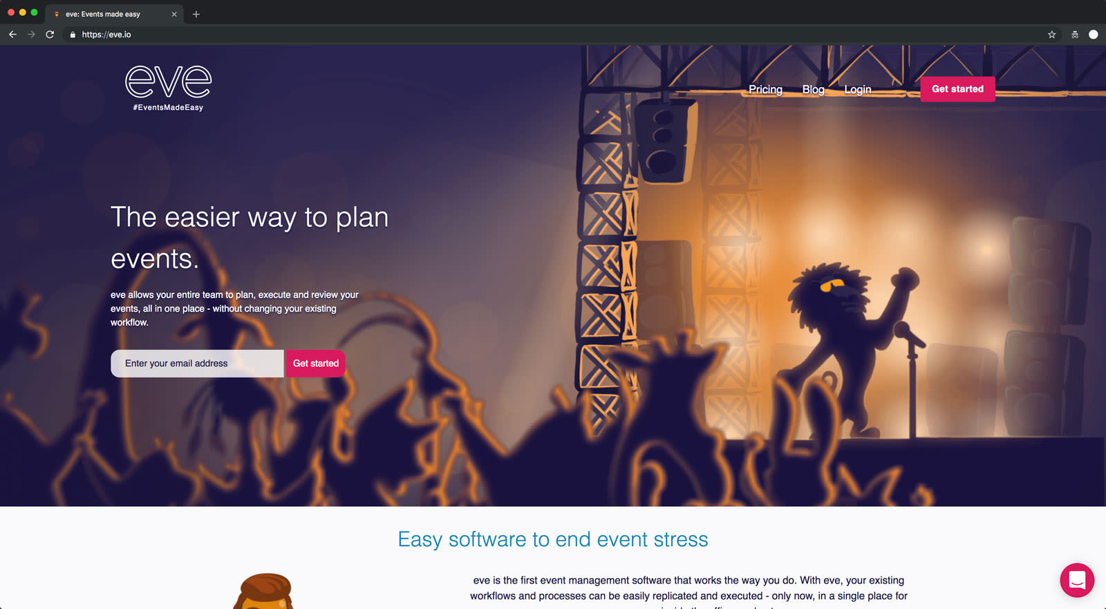
The Analysis
The prospects for event management software may already recognize the need for a solution, but if not, this landing page needs more education on the challenges of planning events. After all, there’s a lot of complexity in running events: multiple stakeholders, shifting timelines, numerous vendors, and changing agendas. The list goes on.
The landing page starts out relatively strong with a benefit-driven headline and a product-level value proposition:
The easier way to plan events.
eve allows your entire team to plan, execute, and review your events, all in one place—without changing your existing workflow.
Leading with a value proposition is the standard choice for SaaS companies. That’s fine, but a lot of marketers struggle with what should go next on the page. For a product like eve—where it’s easy for the prospect and the whole world to minimize the pain of event planning until you’re two days away from the event and panicking—I’d recommend moving swiftly from discussing the value prop to outlining and fleshing out the problem eve solves.
It may seem like that’s accomplished with the first crosshead under the hero:
Easy software to end event stress
But that crosshead leads with the solution (“easy software”) when it ought to focus entirely on the pain (“event stress”). The PAS—or Problem, Agitation, Solution—framework helps lay out copy in a way that it zeroes in on the driving force behind choosing a painkiller solution like eve: the pain.
My biggest advice is choosing copy that doesn’t glide over that pain. So swap this:
“How hard could it be to plan and coordinate a live event?”
with this:
“How hard could it be to plan and coordinate a two-day conference with 20 speakers from around the globe and 500 attendees?”
The first option is safe. The second option is sticky.
Too often we try to boil everything down to its safest version. And we sacrifice specific, sticky copy that might actually hook and convert actual prospects. It’s not our fault. Everyone we know is writing safe copy. If we go bold, we’re taking a risk.
Test it and see, but my encouragement is to go for it. Rare is the business that makes waves today without either 1) a huge marketing budget to overcome their safe messaging or 2) a memorable way of connecting with people. Endeavor to be uncomfortably specific with your prospects. It shows you’re in touch with the precise pain felt by the professionals in your market.
Company: Scribendi
What it does: Editing and proofreading services for English documents
Landing page challenge: Understanding scale and results
The fix to apply: Visualize—don’t just display—data.

The Analysis
Overall, the copy on this page is strong. But copy is not always words, but numbers.
Further down the page, there is some impressive proof of impact on clients served, words proofread, and editors in action:

These are striking figures, but they also come with complications.
First, I’m sure I’m not the only person who misread 1.6B as 1.6M. That sounds like a lot, but how many documents does that mean? Is it 10,000+ ESL papers for academics or 100,000 essays for undergraduates?
I suggest keeping the data as is but adding in a visual that shows the scale of the achievement. Here’s one way to back into a compelling visual via a quick calculation: 1.6B words is actually 6.4M pages. That’s 318,939 millimeters. That’s 1,046 feet. That’s amazing. That’s more than half the size of the CN Tower in Canada—or insert your local landmark relevant to your audience.
Help your prospects visualize the work you’ve done—and don’t be afraid to reference something outside your market to make the case for your market. Numbers are good. But I believe the saying goes: Whoever draws a picture wins.
Customer awareness: Map your customers’ awareness
Company: Join It
What it does: Member management software
Landing page challenge: Assumes visitor is solution aware
The fix to apply: Shift to the mindset of a solution-aware prospect.
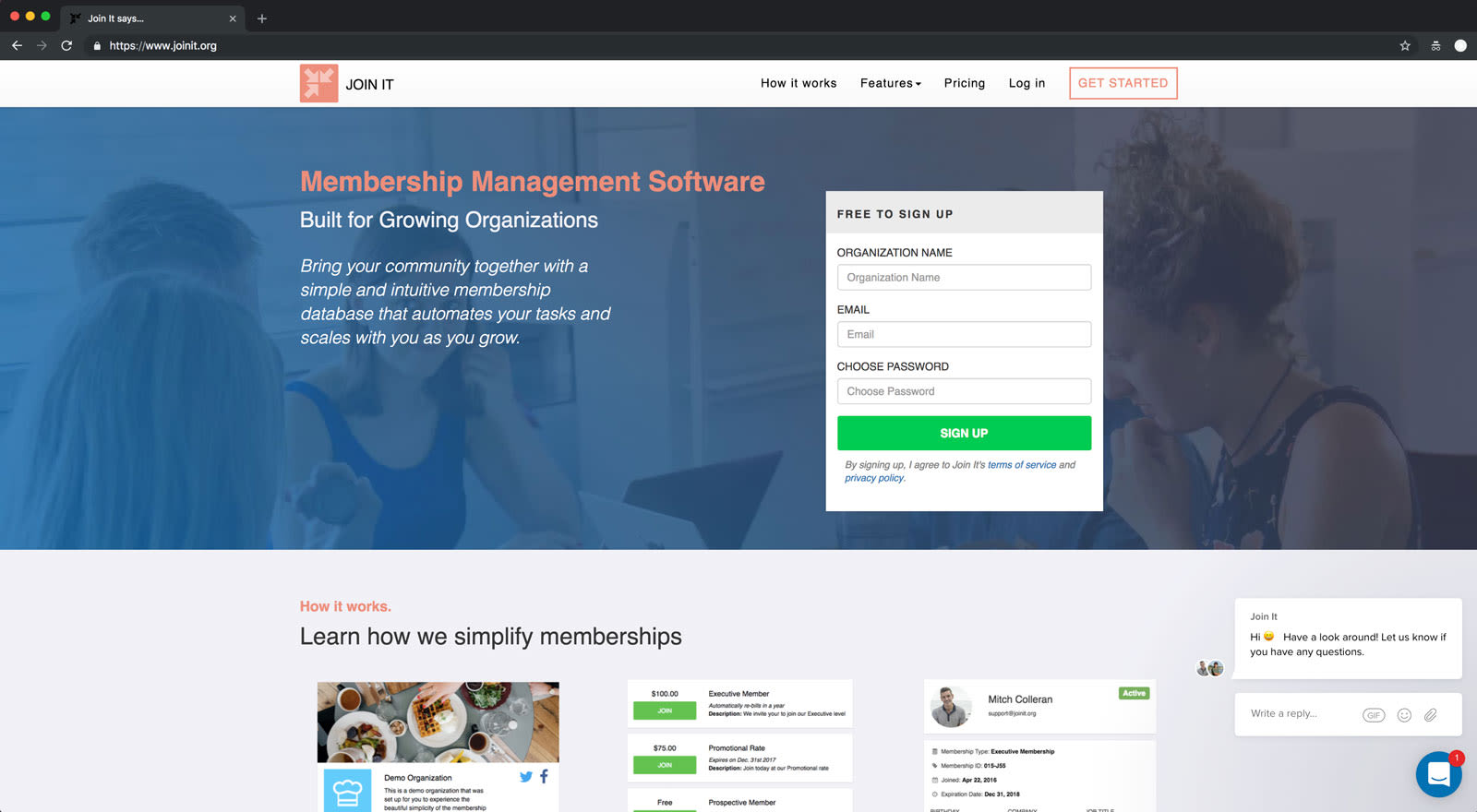
The Analysis
This headline—Membership Management Software—is great for search engine optimization (SEO), but it’s so technical that it’s jarring, especially as the first three bold words on the page.
For a headline like “Membership Management Software” to work, its prospects need to be sophisticated and “solution aware.” Here’s where that stacks on the five stages of awareness:
Most aware. Visitors totally understand your solution and likely believe it’s a top contender for them. They just need nudging. Purchases happen here.
Product aware. Visitors are learning about your product. Free trials, demos, and purchases happen here.
Solution aware. Visitors are considering solutions to their pain or problem.
Problem aware. Visitors are feeling pain or dealing with a problem.
Unaware. Visitors haven’t experienced a need that would drive them to your solution.
If prospects are solution aware, they’re actively seeking “membership management software” and would easily call it that. However, Join It is eliminating a segment of prospects by only addressing solution-aware visitors. By finessing headlines and copy to match the problems or state of mind of prospects, Join It can open its aperture to capture more potential customers. Here’s how that might look with tweaks to copy:
|
Stato d'animo del potenziale cliente consapevole della soluzione al suo arrivo
|
Copia del titolo corrispondente
|
|---|---|
| Ho sentito che il software di gestione degli abbonati può aiutarmi ad automatizzare tutte le attività della comunità che faccio fatica a gestire. | Ora puoi automatizzare il coinvolgimento della comunità con un semplice software di gestione degli abbonati |
| Ho bisogno di un software di gestione degli abbonati che faccia tutte queste cose. |
Le organizzazioni in rapida crescita hanno bisogno di software di gestione di appartenenza che:
|
| Sto pensando di cambiare il software di gestione degli abbonati X, che non mi piace a causa di Y. | Metti fine a Y con un software di gestione degli abbonati facile da gestire e scalabile |
| Devo essere terrorizzato da tutto il lavoro che mi aspetta quando introduco una soluzione di gestione degli abbonati nella mia organizzazione? |
Software per la gestione degli abbonamenti Quanto sarebbe più facile far crescere la tua azienda se potessi automatizzare la tua comunità? |
A shift from solution-aware language to the state of mind of a prospect may seem like you’re downshifting to a problem-aware visitor. This stage of visitor might seem further from a product-aware prospect, where a sale can occur.
But given the market maturity for membership management software, Join It will open its top of the funnel to more prospects if it makes its headline more accessible to more visitors. And it’ll still be relatable to solution-aware and product-aware prospects.
Company: Parkpnp
What it does: Marketplace for unused or underutilized parking spaces
Landing page challenge: Incorrect assumptions about the visitor
The fix to apply: “The Rule of One”

A key part of customer awareness is understanding the context and drive for their visit—all of which should be reflected in the copy and experience of a page. That nuance can be the difference between a visitor identifying you as a hero in their lives—or a villain.
In the case of Parkpnp, context and drive are pivotal factors for its solution. An app that allows you to find a parking space might be used in advance of an anticipated painful parking experience, such as major sporting events. But it’s more likely to be used in the heat of the moment, when the pain for a prospect is most visceral and distractions abound.
In short, most people will use Parkpnp when they are driving their cars looking for a place to park in a busy area. Their pain is high. Their motivation to solve the pain is high.
They need a hero.
Is your site a hero or a villain in that moment?
The current hero section copy and experience sets up the solution to be more the villain than the hero. First, it puts work on the user’s plate by asking for an address—which holds true on both mobile and desktop. But perhaps more glaringly, it makes assumptions about what “perfect” means to the user. In fact, perfect parking could mean:
It’s near where I am now.
It’s closest to my final destination.
It’s available now.
It’s available regularly/always.
It allows overnight parking.
It’s the cheapest option in the vicinity.
It’s free.
It accepts credit card payments.
It's patrolled by security.
It’s covered.
It has extra-wide parking spots.
It doesn’t require parallel parking.
It’s got special needs access.
The word “perfect” is trying to cover all manner of desires in the headline for this page. But perfect for User A may not be perfect for User B. This is where the business needs to make a decision: What’s the primary prospect’s top definition of perfect parking in the moment they use the solution?
This question gets to the heart of what copywriters call the Rule of One, which holds that you are always writing a landing page with the following four points identified first:
Your One Reader
Your One Big Idea (or culture-shifting idea)
Your One Promise (or desirable measurable outcome)
Your One Offer
Of all parts of the Rule of One, your One Reader is the most important. You can’t write an effective page without first identifying your One Reader. Once you know your One Reader well, you know what pains drive them, what benefits they’re looking for, what offer they’re most likely to respond best to, what kinds of social proof will move them—the list goes on. You do not have to get incredibly detailed on your One Reader, but you do have to know them well enough to look at the above list of definitions of perfect parking and know which one they would choose if they could only choose one.
The one they would use is the one you use.
In the case of Parkpnp, if the One Reader defines perfect parking as parking that’s near where I am now, the headline would change and so would the CTA. Here’s how:
|
Da...
|
A...
|
|
|---|---|---|
|
Titolo
|
Trova il parcheggio perfetto per te | Trova subito un parcheggio disponibile nelle vicinanze |
|
CTA principale
|
Campo: dove vorresti parcheggiare? Pulsante: trova parcheggio |
Pulsante: trova parcheggio nelle mie vicinanze |
|
CTA subordinato
|
Pulsante: trova parcheggio nelle vicinanze | Link: trova parcheggio per una data futura, un evento o un'esigenza a lungo termine |
That’s how your site goes from being a villain to being a hero.
Now, if your One Reader would define perfect parking as parking near my work that doesn’t cost half my paycheck or safe parking for my daughter who’s away at college—that is, if they’re planning for future parking needs—the headline and experience would change accordingly, of course. You don’t have to get that specific. But if you can get that specific in your headline, you’re more likely to convert your visitor. The alternative is writing a headline that serves a huge range of audiences. But, be forewarned: A hero to all is a boring character—and more likely to be ineffectual for the business.
Company: eCourtDate
What it does: Timely digital court date reminders
Landing page challenge: Unclear who the user is
The fix to apply: “Ideal for” statement
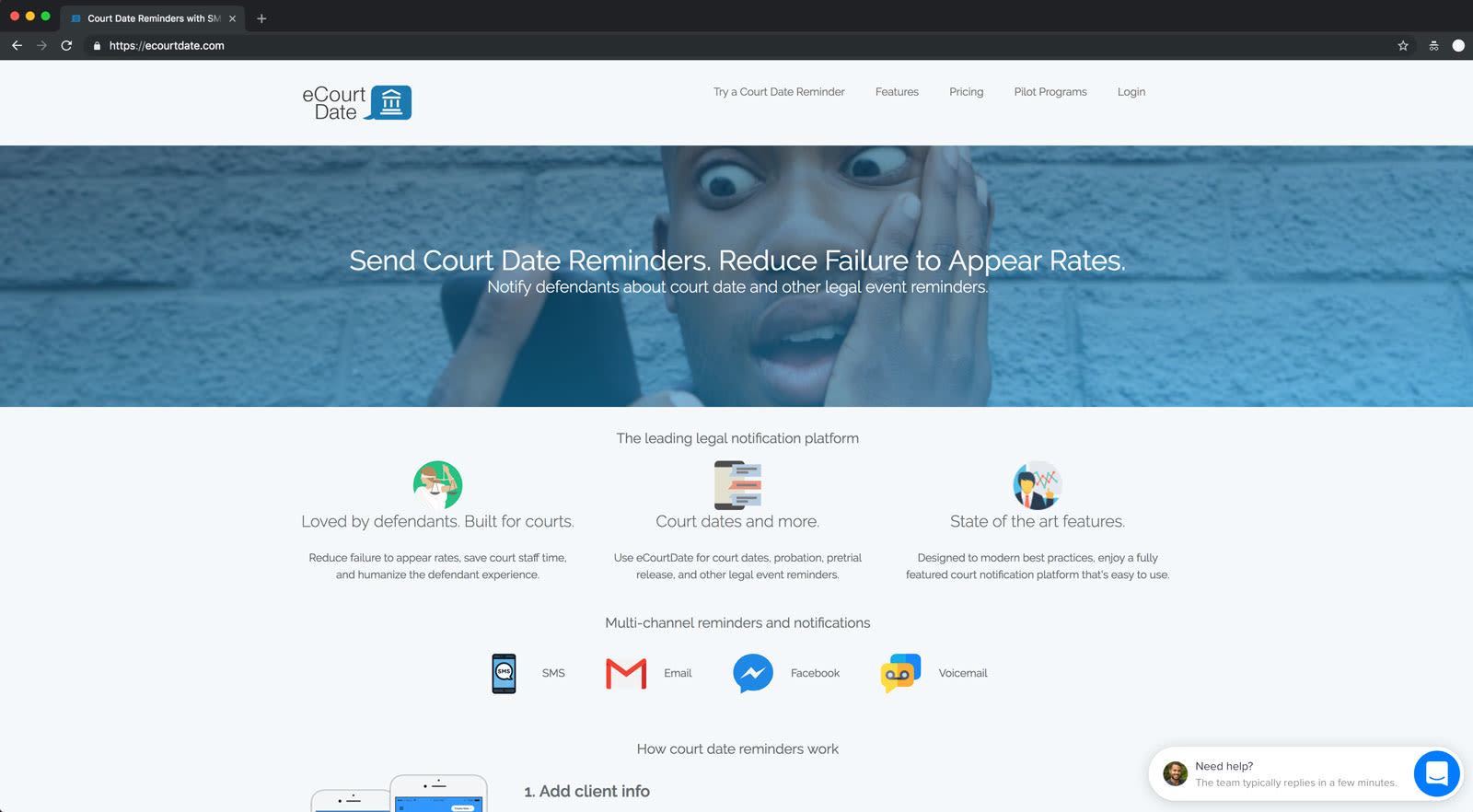
Here’s the first—and most important—question about eCourtDate’s landing page: Do people land on this page and know if the service is meant for them?
One of the cleanest, easiest ways to optimize your copy is to use an “ideal for” statement. That statement can appear anywhere on your site, but it’s best that it appears closer to the top of your landing page. That’s especially true for a service like eCourtDate, where the user is unclear. It might be for lawyers, police officers, the court, defendants, and plaintiffs—maybe even those serving jury duty.
Whichever one it is, put that on the page in an “ideal for” statement like:
Ideal for lawyers with criminal and DUI cases
If it’s for more than one user, that’s fine. Put those names on the page:
Ideal for criminal lawyers, traffic cops, and courthouse administrators
From there, the headline and subhead in the hero have context and communicate the service more clearly. To enhance the copy, take a few extra steps. Answer why it matters, and add proof that you’ve done it. This rule is known as “So what”/“Prove it.”
Here’s how the copy might look with those two elements addressed:
Ideal for busy courthouse administrators
Send court date reminders.
Reduce failure-to-appear rates.
Notify defendants about court dates and other legal events. Save up to 20 hours per month of court staff time. Reduce court no-shows by 33%. And humanize the defendant experience.
Bolster this copy with testimonials from previously frustrated and now happy court staff or judges. These improvements all stem from articulating the ideal user for the service at the onset.
Take the first step with your landing page copy
Landing page copy is an underleveraged, powerful tool. Done right, it builds brand, engenders trust, and sells product—to anyone with an internet connection, on their schedule. But it’s not automatic. Landing page copy must deliver a convincing first impression, consider the maturity of the market, and reflect the customer’s stage of awareness. It must meet prospects where they are and get them to where they—and the business—want them to be. Once it does, hand waves become high fives, and high fives turn into handshakes—and conversions can happen without much human intervention.
Don’t overthink where you should start. Just get started. A landing page can—and must—always improve. If you have limited time and resources, run through the quick wins to make tweaks that generate outsized gains. If you have more time, revamp your copy to orient around making a lasting impression, the maturity of the market, and customer awareness.
Landing page copy is only one channel to the customer. Get tips on email marketing, or hone your cold emails and calls with this guide on finding your first customers. If there’s a related topic you wish we’d cover, drop us a line at: atlas@stripe.com
