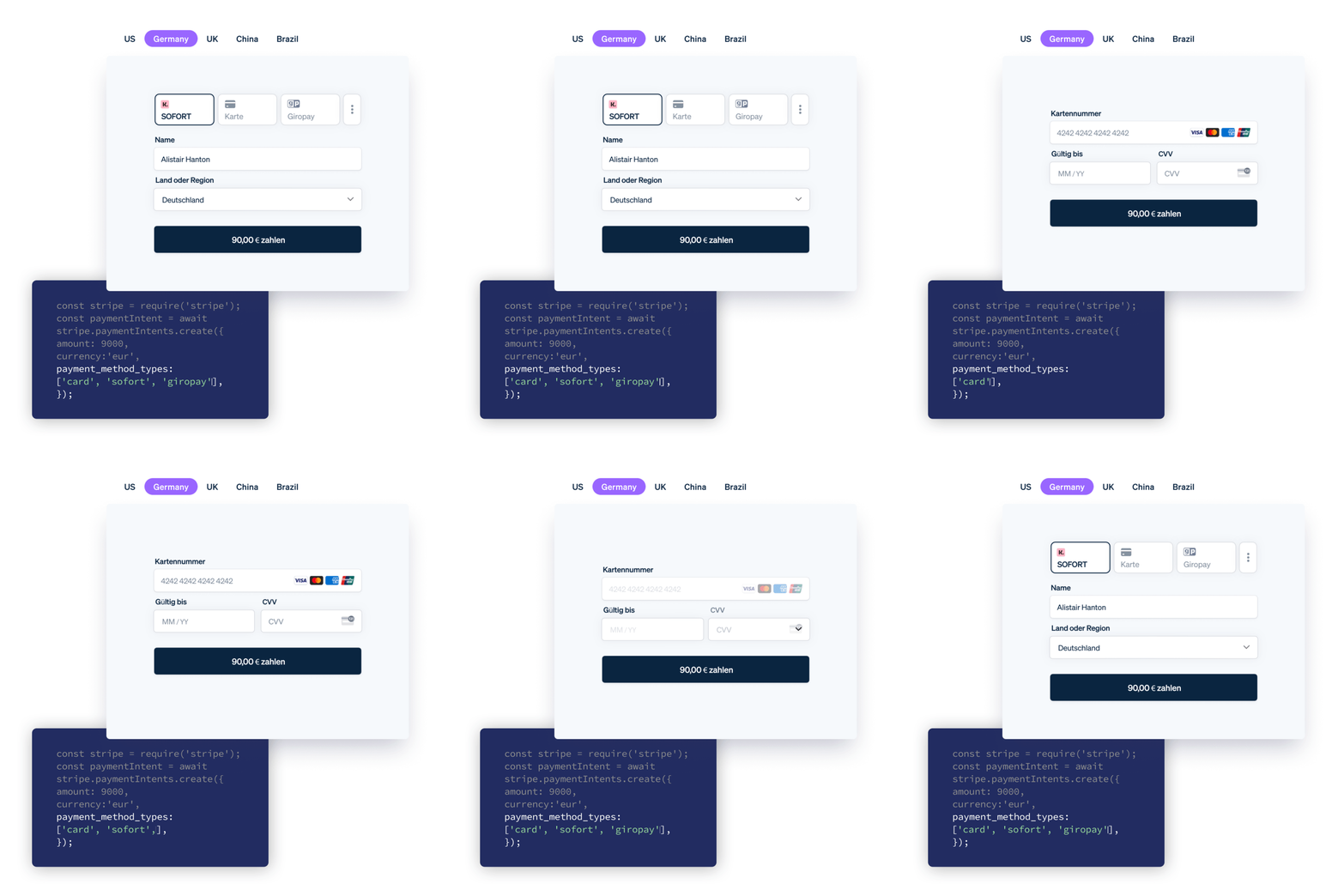
Introducing the Payment Element
When we launched Stripe Elements in 2017, our goal was to make it easier to build customized checkout flows that help maximize conversion. Increasingly, a critical piece of optimizing conversion is allowing your customers to pay how they want to pay—whether that be with a credit card, a mobile wallet, an installment plan, or a local payment method. Not surfacing the right option can significantly impact your bottom line—16% of consumers have abandoned a checkout page because their preferred payment option was not available. That’s why today we’re introducing our biggest upgrade since we first launched Elements: the Payment Element, an embeddable UI component that supports 18 payment methods with a single integration.

Add payment methods with a single integration
Adding new payment methods previously required building a separate front-end integration and custom logic for each one. Between the setup and ongoing maintenance of adding each new payment method multiplied by all the surfaces you want to support, this could take weeks or even months of engineering time. The Payment Element eliminates all of this incremental work. Now you can simply integrate one component onto your checkout to access all our supportable payment methods across cards, mobile wallets, buy now pay laters, vouchers, bank debits and redirects. The Payment Element is available for both web integrations and native mobile apps.
Here’s what else is new with the Payment Element:
- Automatic input collection: The Payment Element automatically adjusts to collect input fields based on the payment method and country (e.g. full billing address collection for SEPA Direct Debit).
- Dynamic sorting and filtering: The order in which payment methods are displayed adapts to your customer’s device and location to optimize for conversion. Payment methods are also filtered to show only those supported by your customer’s local currency.
- Turn on payment methods with no code: You can turn new payment methods on and off directly from the Dashboard without having to update your UI, eliminating the need for ongoing engineering support.
As with all our Elements, you can choose as many or as few of these capabilities to incorporate depending on how much control you’d like to maintain over your checkout flows.
We migrated to the Payment Element in less than a day with a single developer. Since then, we’ve seen a 6% increase in conversion at checkout.
With Stripe Elements, we were able to instantly turn on iDEAL, Bancontact, EPS, and Giropay. As we rapidly enter new markets, it’s important that we’re able to scale new payment methods without being limited by engineering bandwidth.

The mobile Payment Element enables you to build a streamlined payment flow within your mobile app and is available for iOS, Android, and React Native.
Optimize conversion without sacrificing customization
The Payment Element comes with built-in optimizations to reduce friction at checkout, whether you’re offering a dozen payment methods or just accepting cards. You’ll automatically get field localization and dynamic collection, input validation with masking, card animations, plus styling and error handling for card acceptance.
You can also customize the look and feel of your checkout flow to match your brand, using the Appearance API to modify colors, fonts, borders, padding, and more. Depending on the level of control you need, either start with one of our pre-built design themes to get going quickly or create your own theme for maximum customization.

Get started
The Payment Element is available in React or Javascript for web integrations and in iOS, Android, or React Native SDKs for mobile apps. Read the docs to get started or check out our demo to see the Payment Element in action.
As always, please let us know if you have any questions or feedback—we’d love to hear from you.
